Intro
AliExpress is the largest online marketplace in the CIS region. When I joined AliExpress, the platform was popular, with 30 million users per month. However, it faced a critical issue—the design was outdated, and user reviews were less than favorable.
I was tasked with “improving the design” and essentially leading a redesign without a complete overhaul. The goal sounded promising, but the specifics were unclear. What did “improve design” actually mean?
Discovery: Understanding the Problems
The first step was to define the main problems. I began with a deep dive into user feedback, analyzing hundreds of reviews to understand their main frustrations.
Analyzing User Feedback
From the feedback, I identified five main pain points:
Visually outdated design
Complicated navigation
Hard-to-Reach Customer Service
Poor Mobile Experience
Dark theme
Analyzing Business Needs
To make sure the redesign supported the company’s goals, I gathered insights from the directors and reviewed the main KPIs and objectives. This helped me align the redesign with business priorities. Through these talks and KPI review, I identified several key business needs:
Inconsistent design
Limited promotional spaces
Weak brand identity
Ineffective homepage
Prioritizing the Problems
After reviewing both user and business needs, I selected two top priorities, or P0 issues, to tackle first:
Visually outdated design
Ineffective homepage
Here’s why:
1. Outdated design was a major issue for users, affecting trust and engagement across the site. Updating it would improve the user experience and modernize the brand’s image.
2. Ineffective homepage directly impacted conversions and user engagement. Redesigning it would provide a more welcoming, engaging entry point for users and improve key business metrics.
By focusing on these priorities, I could make changes that would benefit both users and the business.
Visual Appeal
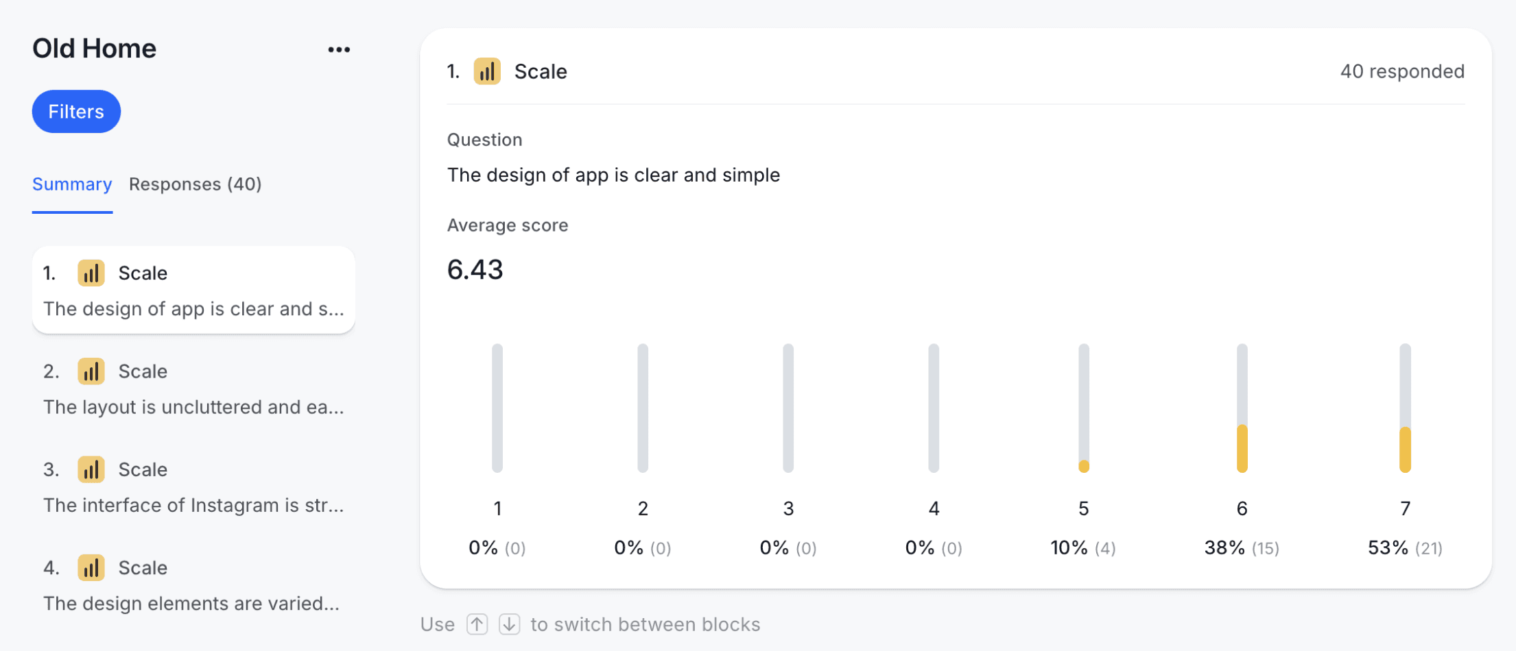
Though aesthetics are subjective, we could still measure them objectively. I used VisAWI (Visual Aesthetics of Websites Inventory) methodology and measured key dimensions: Simplicity, Diversity, Colorfulness, and Craftsmanship
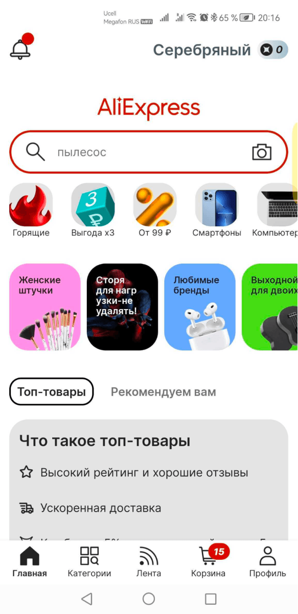
Old app
I conducted a survey, asking 300 respondents 12 questions focused on main sections: homepage, search, product page, checkout, and cart. Here’s where we stood:
• Simplicity: Average score = 5.45
• Diversity: Average score = 5.29
• Colorfulness: Average score = 3.88
• Craftsmanship: Average score = 3.86
Colorfulness and craftsmanship were our weakest points.
Users survey
Who is our core audiece
Our primary audience includes middle-aged adults and young women, but it lacks the typical FMCG demographic. AliExpress serves unique purposes and use cases.

Core audience
What do we sell
Five main product groups generate 90% of our gross merchandise value (GMV).
Electronics
23%
Parts
16%
Home organization: 18%
Fashion
31%
Hobby
10%
Define: Setting the Redesign Goals
With insights into our audience, design measurement criteria, and key issues, I was ready to set the redesign goals. Since there were many problems to solve, I tackled them one at a time, starting with an isolated project as a test case.
I wanted to try a new design approach to one separated project — then measure it — then spread over other parts
Develop: Crafting the Solutions
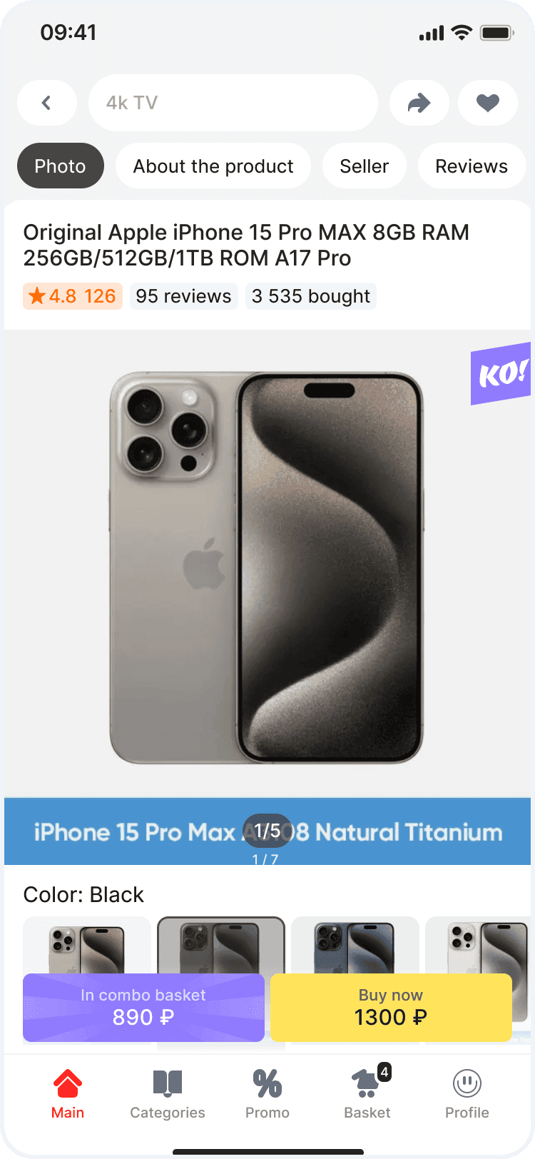
One Price Design
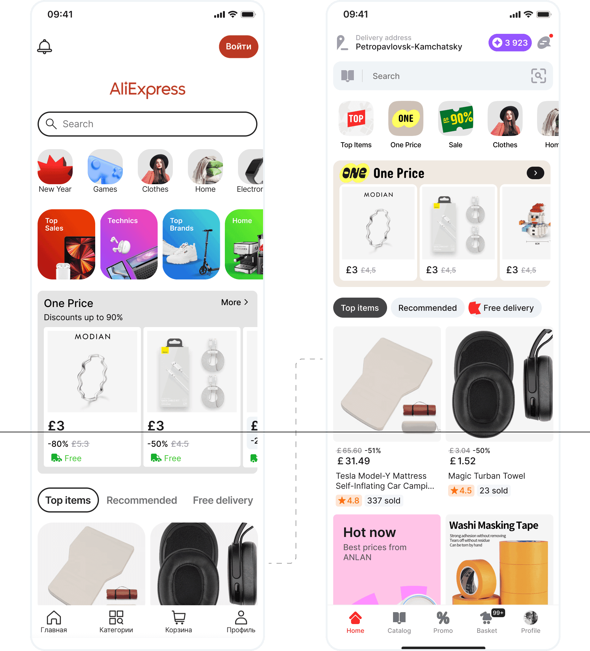
For the test, we chose the One Price channel. This channel was a good starting point since the current design was outdated, and it lacked a distinctive concept.
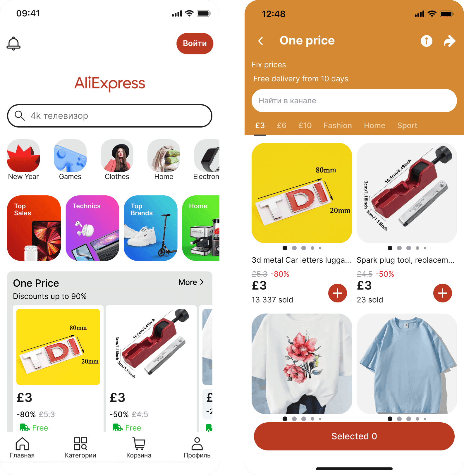
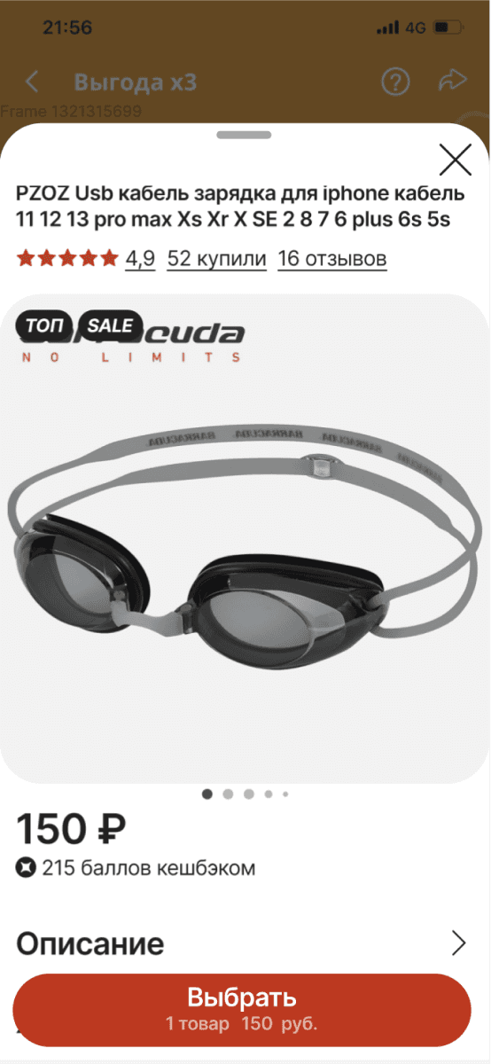
Old app
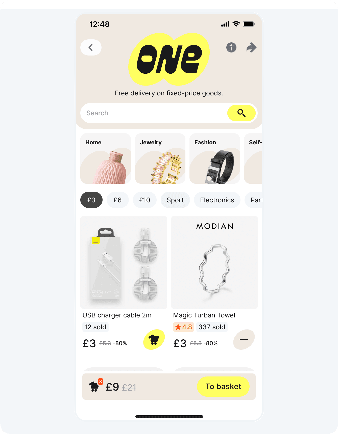
One Price is a channel where all products share a fixed price. We experimented with a coin theme, symbolizing uniform pricing. Tested it in product and aligned with our brand vision
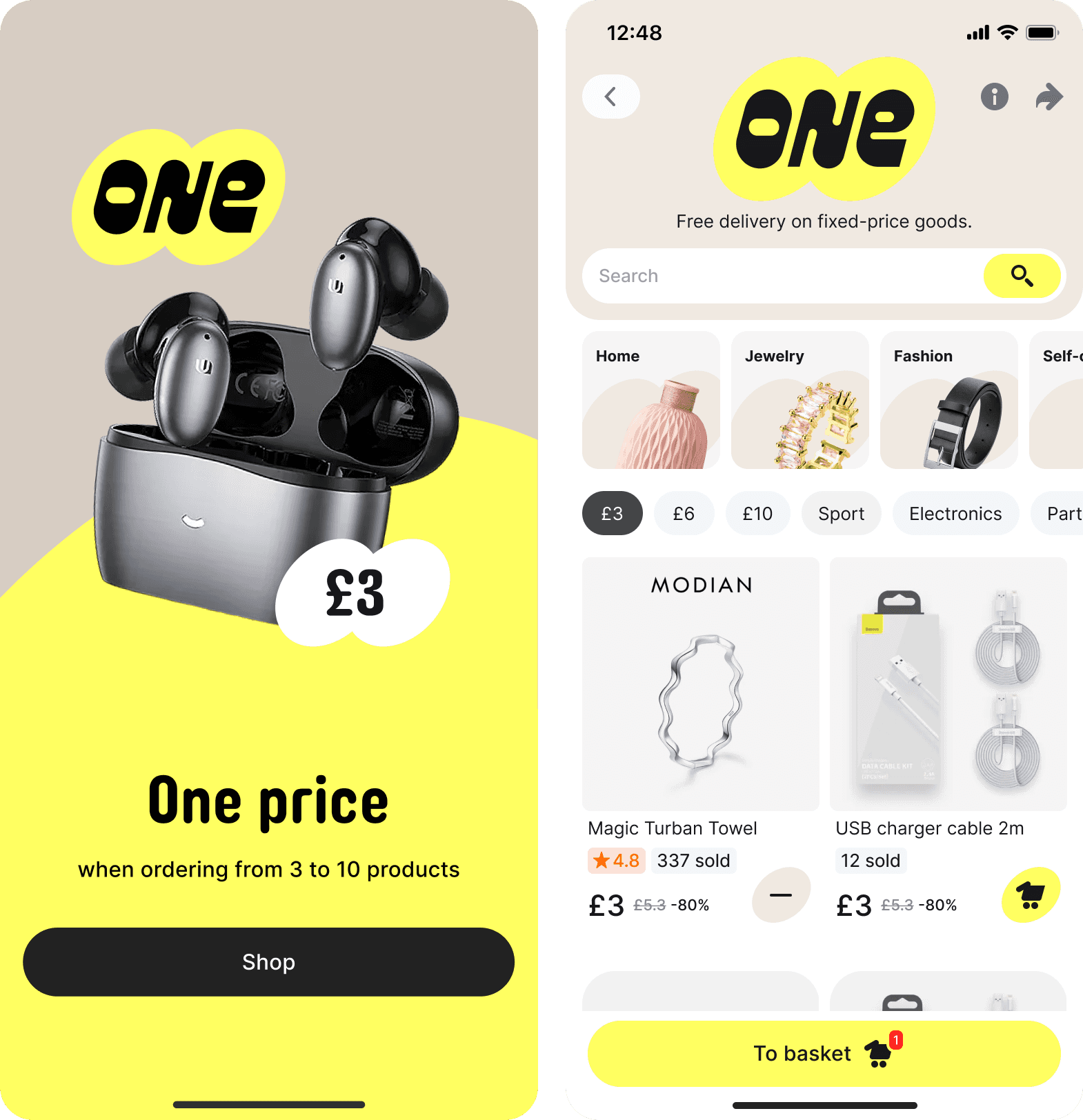
One Price brand and app redesign
It was time for A/B tests!

So, after first A/B test we found a 7.65% drop in orders. This outcome was surprising, as users had shown a strong preference for the new design in surveys. However, the “devil was in the details”. We reviewed the issues and refined the design with new hypotheses

Some hypothethis were confirmed, but not all and total orders were still less for 4%

This time, total orders increased by 7.3%!
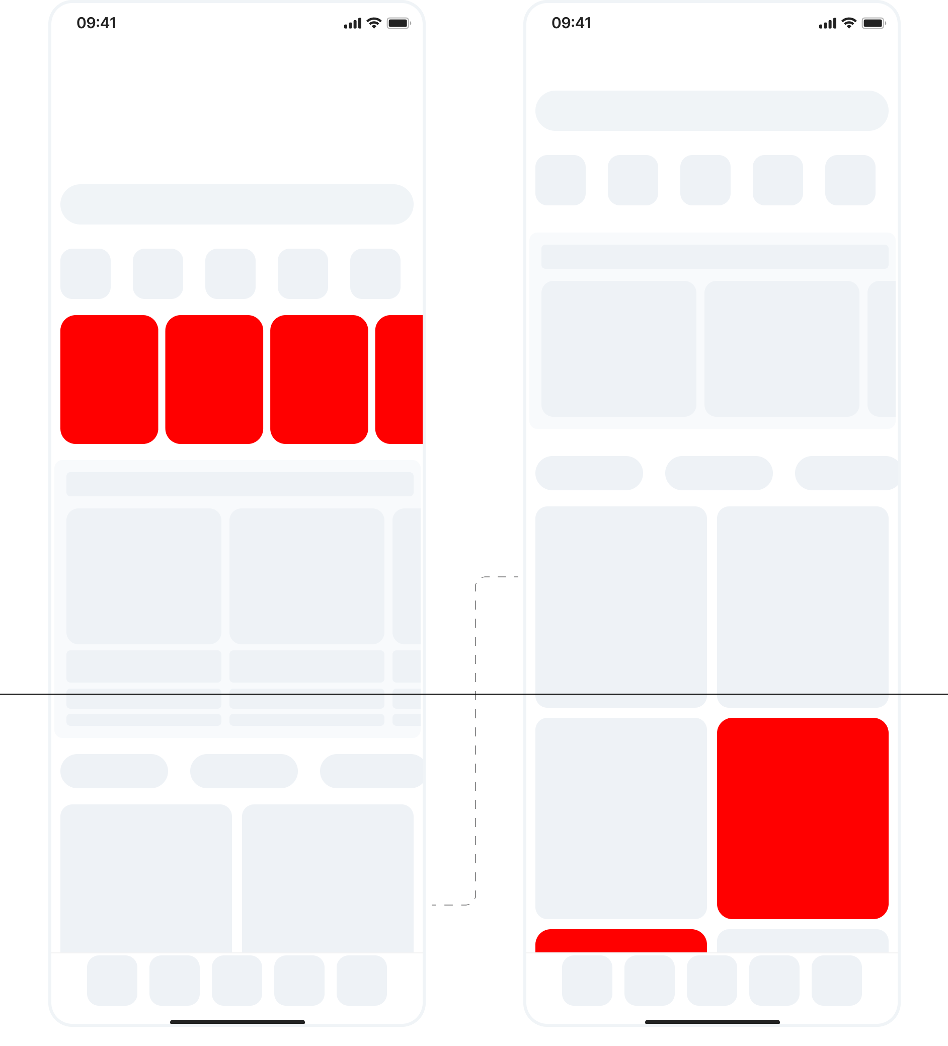
Home Page
Encouraged by the results, we moved on to the homepage. It needed to balance sales from the recommendations feed with driving traffic to other channels and promotions.
We analyzed every aspect of the page: 43% of revenue came from the search field, 35% from recommendations (even though it wasn’t in the first viewport), and 15% from other channels like One Price. Promo banners took up a large portion of the screen but received little interaction. Business stakeholders wanted to retain these banners, but we also needed to optimize the layout.
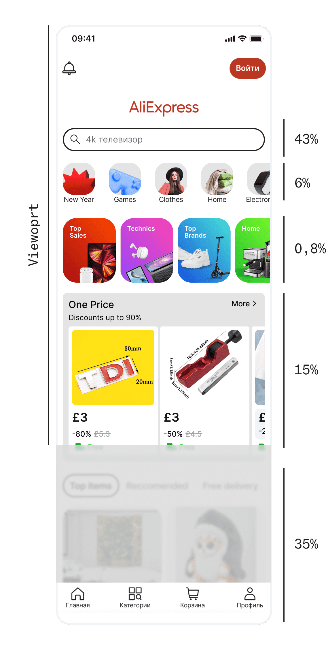
We decided to:
• Move recommendation blocks higher up for visibility
• Keep promo banners but distribute them among items
• Reduce the size of the One Price section but maintain visibility
• Remove the AliExpress logo (unnecessary here)
• Make other design tweaks for aesthetic balance
After several tests, we observed:
• A 12% increase in orders from recommendations
• A 7% increase in CTR for promo banners
Other Parts of the App
We implemented similar updates across the app, following a process of side-by-side testing, user reviews, and A/B testing.
Deliver: Results and Impact
Visual Appeal
The VisAWI survey was conducted again, showing significant improvements:
• Simplicity: Average score = 6.14
• Diversity: Average score = 5.98
• Colorfulness: Average score = 6.59
• Craftsmanship: Average score = 6.36
Colorfulness and craftsmanship showed marked improvement.
User reviews
User feedback also improved significantly. Our Google Play rating rose from 3.4 to 4.6, with over 2.4 million reviews.